
Have you ever walked past a storefront in Alpharetta or Milton and instantly felt like the business inside was stuck in the past? Maybe the colors were dull, or the font looked like it belonged in a ’90s sitcom. You might not have realized it, but your brain was making a split-second decision about that business before you even saw their products.
In the busy commercial corridors of Metro Atlanta, those first impressions happen fast. Your signage is essentially a 24/7 ambassador—but if that ambassador is looking a little tired, it might be sending the wrong message to potential customers.
Here is what your customers are actually noticing when your business signs start to show their age.
1. The “Attention to Detail” Signal for Your Storefront
Think of your sign as the cover of your business’s book. If an outdoor building sign is faded by the harsh Georgia sun, peeling at the corners, or has a channel letter that only lights up halfway, customers don’t just see a maintenance issue; they see a lack of attention to detail.
When a storefront looks neglected, people subconsciously wonder if that same neglect carries over to your customer service or the quality of your work. On the flip side, a crisp, well-maintained sign suggests a business that is thriving and protective of its reputation.
2. Eliminating “Brand Friction” Between Digital and Physical
Businesses evolve. You’ve likely updated your website, refined your services, or modernized your logo over the last few years. But if your physical sign still features an aesthetic from a decade ago, you’re creating what designers call “brand friction.”
Consistency builds trust. If a local resident finds you on a modern, sleek Instagram page but arrives at a shop with a dated, mismatched sign, it creates a moment of hesitation. To stay competitive in Fulton and Cherokee counties, you want the transition from digital to physical to feel seamless.
3. The “Invisible” Problem: Readability and LED Retrofitting
Sometimes the problem isn’t that the sign is “ugly”—it’s that it is becoming invisible. Over time, materials lose their contrast, and what used to “pop” against your building might now blend into the background.
Older signs often suffer from two main issues:
- Outdated Fonts: Certain styles that were trendy years ago are actually quite difficult to read from a distance or at night.
- Dull Lighting: Old fluorescent bulbs dim slowly over time. If your business looks “dim” compared to your neighbors, it’s time to consider LED retrofitting. Modern LEDs are brighter, last longer, and are significantly more energy-efficient.
4. Keeping Up with Modern Trends in Woodstock and Milton
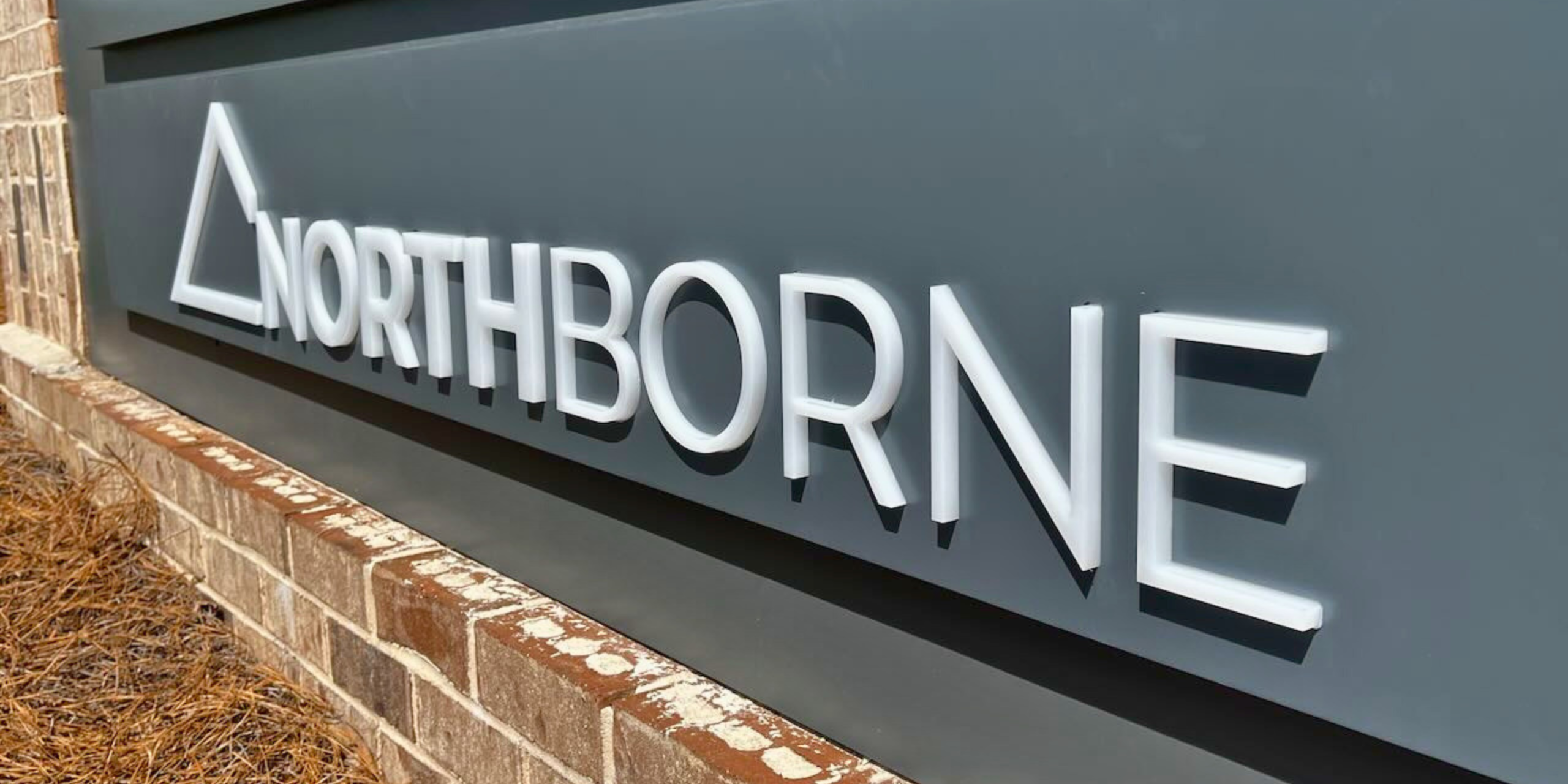
Take a drive through downtown Woodstock or the Milton city center. You’ll notice that more businesses are moving toward high-impact visuals like dimensional lettering that adds depth or vibrant custom window graphics.
If your sign is flat and fading while the shop next door is bright and dimensional, you’re naturally going to lose the battle for a driver’s attention. Modern materials like high-quality acrylic and UV-resistant vinyl aren’t just about looking “fancy”; they are specifically engineered to hold their color and shape in the Georgia heat.
5. Improving Customer Experience with Clear Wayfinding
We’ve all had the frustrating experience of trying to find a suite number or a specific entrance and failing because the signs were confusing or missing. Wayfinding and directional signage isn’t just a nametag; it’s a guide.
From the monument sign at the street to the directional signs in your hallway, clear communication tells your customers that you value their time and want their visit to be stress-free.
A Quick Signage Audit for Your Business
Next time you head into work, try to see your business through the eyes of a stranger. Park across the street and ask yourself:
- Can I clearly read the business name from a distance?
- Does the sign feel like it belongs to the same brand I see on our website?
- Are there visible signs of wear, like rust or peeling paint?
- Does this look like a place I would be excited to visit for the first time?
Expert Signage Solutions in Metro Atlanta
At Tangerine Sign Studio, we’ve helped businesses across Fulton, Cherokee, and Cobb counties find their visual voice. We believe your sign should be your best salesperson, not an afterthought.
Whether you’re looking for a subtle refresh, sign repair, or a complete brand transformation, we’re here to help you stay relevant in an ever-changing market.
Ready to refresh your look? Contact us today for a professional signage consultation.
Disclaimer:
The information provided on this website is for general informational purposes only and should not be considered professional or legal advice. While Tangerine Sign Studio strives to ensure the accuracy and timeliness of the content, we make no representations or warranties of any kind, express or implied, regarding the completeness, accuracy, reliability, or suitability of the information, services, or related materials on this site. Any reliance on the content found here is strictly at your own risk. Tangerine Sign Studio shall not be liable for any loss or damage, including but not limited to indirect or consequential loss, arising from the use of this website. Links to third-party websites are provided for convenience and informational purposes only; we do not endorse or have control over their content. For specific guidance on signage projects, permitting, or design recommendations, we encourage you to contact our team directly.