Key Takeaways
- A business sign should be considered an essential part of an overall marketing strategy. It must represent quality and authority while attracting ideal customers.
- Before choosing a sign, it’s important to define business goals, understand the target audience, and research local zoning laws to avoid fines or delays.
- Evaluating location, visibility, and industry-specific needs will help in selecting signage that stands out from competitors and serves its purpose effectively.
- Balancing aesthetics with function is key—clear fonts, bold colors, and simple messaging maximize impact and readability.
- Understanding the differences and advantages between digital and traditional signage options enables a more informed decision. In some cases, using both can offer greater flexibility and engagement.
- Partnering with a skilled and detail-oriented sign company ensures the investment makes the greatest impact. Planning for future maintenance, such as regular LED bulb replacements, supports long-term compliance and effectiveness.
How to pick the perfect business sign for your industry means knowing what works best for your space, your brand, and your customers. I try to find signs from every industry that perfectly reflect the vibe of each business. I select bright, exciting looking channel letters for retail and sleek plaques for offices.
Perhaps you need a sign that can be seen after hours or one that complies with rigid landlord specifications. Size, contrast, illumination, and movement all affect how people identify and recall your location. In short, signs are critical to first impressions and trust, so the right sign can help win people over before they ever step foot inside.
Coming up next, my best actionable advice and 30-second tests to help you make the smart choice. Here are a few strategies to help you pick the perfect sign for your industry.
Key Factors Before Choosing Your Sign
Choosing the perfect business sign involves considering various factors that influence how people perceive your establishment. Your sign only has a few seconds to catch the viewer’s attention. No matter if you operate a popular coffee shop, an esthetician practice, or a 24-hour convenience outlet, it brings attention.
You’d want to be sure it’s going to stand out, but for all the right reasons, and that it falls in line with everything your brand represents. With the proper checklist in place, you can ensure you’re making the right moves that will drive more business to you.
1. Define Your Business Goals Clearly
Determine what you want your sign to achieve right off the bat. Whether you want to attract more foot traffic or make your brand more memorable, list out the primary objectives.
For instance, a bakery might want to increase foot traffic, while a legal firm might want to establish credibility. Establish specific, measurable goals. When it comes to signage, that might look like measuring the level of foot traffic after installation of signage.
2. Understand Your Target Audience Deeply
Your sign needs to resonate with the audience you are trying to attract. Consider their age, their interests, and how they use their time.
Color picks matter: the Outdoor Advertising Association of America shows high color contrast lifts recall by 38%. If your audience is younger, use fun colors and bigger, bolder fonts. If you’re looking to attract upscale clientele, go for straightforward designs mixed with deep hues.
3. Analyze Your Location And Visibility
Take a few minutes to observe how cars and pedestrians travel around your location. A sign by a busy road needs to be bigger and well-lit, while one on a quiet street may need strong color or backlighting.
Plan to use at least 30 to 40 percent of the sign as white space for the quickest reading and best visibility. In dim surroundings or at night, illuminated signs ensure your statement shines bright, rain or shine.
Exploring Popular Business Sign Types
Business signs are one of the most versatile structures available, and there’s a myriad of types that offer distinct advantages for every requirement. As you look at your options, you’ll see projecting signs, as well, such as blade signs, that sort out from the establishment.
These signs draw foot traffic from each direction. These signs are great because they help make your storefront visible from a distance, and attractive blade signs enhance your curb appeal while allowing you to save space. Your expenses may increase if you choose high-end materials or require custom mounting, but the value is in the high visibility.
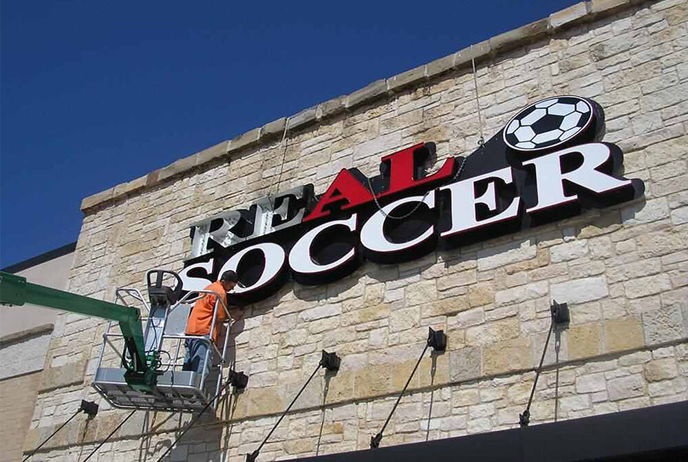
Channel Letters Vs. Dimensional Letters
Letter-based signs are often discussed in terms of channel letters versus dimensional letters. Channel letters provide a three-dimensional look and really pop out from the façade, particularly when incorporating internal lighting to be used at night.
We custom-cut dimensional signs from dense materials, including metals or acrylic. These signs add a powerful and earthy element to your branding. Selecting the proper letter size and font style is important when it comes to readability. Matching your sign’s material to your brand’s aesthetic gives a polished, unified appearance.
Ground-Level Signs
Ground-level signs are typically either monument or pylon types. Monument signs, often 10 to 20 feet tall and set on poles, stand out from far away and fit well near busy roads. Pylon signs extend even further up, which makes them a favorite of shopping centers.
Just be sure to read local regulations before you install these.
Panel Signs
Panel signs, such as post and panel configurations, are adaptable. Plus, it’s super easy to switch out information to promote sales or in-store events. Experiment with color and form to add more visual punch.
Illuminated And Digital Signs
Illuminated signs using LED modules stay bright at night while consuming significantly less energy. For businesses needing dynamic content, LED digital displays offer even more flexibility and visibility.”
Interior and wayfinding signs guide people around your premises and convey what matters most.
Designing Your Sign For Maximum Impact
So, when I personally look at business signs, I don’t just see names, logos, or whatever they are displaying. It’s the first handshake a brand has with their prospective customers. Your sign says a lot about your business, even before you say a word.
It needs to instantly communicate what you value and welcome people on a human level. A good sign uses a few key rules: keep it simple, make sure it fits the brand, and choose colors and images that match what your customers like.
Choose Colors That Resonate Strongly
Don’t underestimate the power of color; colors do a tremendous amount of work. I choose font styles that are in line with the brand and portray the mood I want to create. Blues convey trust, reds communicate energy, and greens are reassuring colors.
I use a lot of high contrast, such as white text on a super dark blue, so that words pop out. A bright accent color leads the design. At the same time, a contrasting secondary color provides an energetic kick, making key details such as your logo stand out.
Using a very simple blue palette, utilizing lighter blue shades for all the highlights, provides a very clean and cohesive appearance across the sign. Choosing an analogous color with a soft gradient can add dimension without overwhelming. After dark, I recommend backlit signs or other soft lighting solutions to ensure your message is visible well after the sun has gone down.
Select Fonts For Easy Readability
I aim for short, easy-to-read, eye-catching headlines in legible, impactful font styles that you can see from across the street. Fonts with thick lines and mainly open shapes have the greatest visibility.
Restricting font options helps maintain a clean look and makes it easier to read at a glance. That’s the key to getting complex ideas through quickly, before drivers miss your sign and never come back!
Integrate Logos And Imagery Smartly
An effective sign displays your logo prominently. I rely heavily on crisp, clean imagery that relates to your operation. An example of a bakery sign with an illustration of a loaf instantly draws you in.
It further features your shop’s logo, so buyers know right off what you provide.

Balance Aesthetics With Functionality
While the aesthetics of your sign are important, equally as important is the task that your sign will ultimately have to accomplish. Beyond design aesthetics, I do my best to test designs to ensure people can see them from far away and grasp the key point quickly.
It’s important to strike a balance since both style and function must thrive in tandem.
Ensure Message Clarity And Brevity
Keep it short, simple and to the point. Short, direct messages always work best. I prefer bullet points or short phrases so people don’t have to pull over and read for long.
Allowing space between words and images lets the message sink in.
Industry-Specific Signage Considerations
Each industry has different needs for business signs. The right sign does a lot more than just tell you where you are. It attracts customers, delivers critical content, and creates the first impression for the way your business is perceived.
Here are some unique signage requirements by industry:
- Retail: bright colors, clear promotions, well-placed signs
- Themed design, menu boards, digital displays for specials
- Healthcare: ADA-compliant signs, easy-to-read, accessible formats
- Professional Services: polished look, credentials, testimonials
- Industrial: bold symbols, safety info, regulatory compliance
- Property Management: wayfinding, rule reminders, contact info
- Late-night/24-hour: illuminated or backlit signs for visibility
Across most industries, some trends are evident time and time again. Digital signs are becoming increasingly prevalent, particularly for locations with high pedestrian traffic.
These monument signs, 10 to 20 feet tall, direct potential customers to the business from great distances. For businesses open late, backlit or illuminated external signs signal to missing persons even at night or if it’s raining.
Retail Signs: Attracting Foot Traffic
Retail signs perform in high returns when you lean into bright, boisterous color palettes. Well-designed placement—with clear sight lines and, if possible, locations like store windows or directly at the curb—provides a competitive advantage.
After all, messages about sales or new arrivals bring customers through the door immediately. Digital message boards in waiting areas provide announcements and draw attention to new and featured items.
Restaurant Signs: Setting The Ambiance
Restaurant signs create the atmosphere. A cozy café might add a chalkboard menu, while a steakhouse uses sleek lettering.
Digital displays allow you to promote existing products, such as daily specials or new coffee blends. Prominent signage displaying nutrition facts goes a long way toward building trust with diners.
Professional Service Signs: Building Credibility
Reception signs, particularly at the point of entry, establish a welcoming tone. Legible fonts and typeset, easy-to-read lists of services will communicate that you’re not messing around.
Professional expertise builds out a signs portfolio featuring certifications, testimonials, or other industry-specific achievements to establish expertise.
Industrial Signs: Prioritizing Safety First
Effective, visible safety signage reduces danger and saves lives. Utilize bright, recognizable symbols people are familiar with, and exceed OSHA requirements.
Replace signs when regulations shift, and keep all road users healthy and secure.
Property Management Signs: Informing Residents
Municipal signs showing neighborhood maps, regulations, and points of contact inform residents and keep them engaged. Position them in high-traffic areas, lobbies, mailrooms, or central corridors for maximum visibility and impression potential.
Digital Vs. Traditional Signage Choices
Selecting the ideal sign for your business depends on what works best for you. It’s equally critical to think about what your customers want. Each provides value in its unique way, but both digital and traditional signage deliver tangible benefits.
Digital Signage
Digital signage catches the eye with colorful screens and can change its messaging in an instant.
Digital Signs Vs. Traditional Signs
Traditional signage has a storied past, proven durability, and requires minimal maintenance. Here’s a clear look at both:
| Type | Pros | Cons |
| Digital | Eye-catching, fast updates, interactive features | Needs power, higher upfront cost |
| Traditional | Durable, simple, one-time cost, classic appeal | No real-time updates, static content |
When Traditional Signs Still Win
Traditional signage becomes eye-catching in local boutiques, shops, and diners – anywhere people appreciate a personal touch. If you run a business with a tight budget, traditional signs cost less up front and last for years, especially those made from sturdy materials like metal or acrylic.
They create an effective local touch and build a meditated feeling of trust and coziness. Time and again, customers perceive traditional signage as friendly and inviting, and that develops a connection over time.
Leveraging Dynamic Digital Advantages
Digital signs lend themselves perfectly to these high-traffic environments. Imagine malls, retail stores, gyms, and coffee shops. You want to promote your daily specials or flash sale, and with just a few clicks, you can do that.
Providing multiple interaction options, interactive screens allow users to swipe for information or participate in a contest, ensuring that each engagement feels new and exciting. Because one digital screen can display lots of messages in a rotating cycle, you don’t ever have to choose just one message to display.
Considering Hybrid Signage Solutions
Combining the two formats engages the widest audience. A simple, sturdy sign out front welcomes regulars, while a digital board inside highlights what’s new.
This hybrid approach helps to control fiscal pressure while still providing the benefits that come from regular, recent, up-to-date changes for users who seek them out.
Finding The Right Sign Partner
Choosing a sign partner is about more than just choosing who to get the cheapest bid from. You’re going to need a team that understands your industry and your goals. Put together a short checklist to get the ball rolling. Confirm that they have deep expertise in your sector.
A partner you can trust, like us at Tangerine Sign Studio, has years of experience working with restaurants, clinics, retail, and beyond. That kind of track record means we can help you sort through all the sign types out there—lighted, dimensional, window graphics, or monument signs—and pick what fits your brand.
Honest communication and collaboration are key. You should have a partner who treats you that way. They need to be communicative through the entire process, from initial design to installation day. Together,rwe can flood the streets with your vision. From there, we’ll work closely together to refine the designs until they truly capture the essence of your business.
Look Beyond Just The Price
Price is the name of the game, but it’s not the whole thing. Our top choice provides excellent all-around value. As you consider your options, pay attention to the sign’s materials and overall craftsmanship. Cheaper signs will require repairs or replacements earlier.
The signs at Tangerine Sign Studio use sturdy metals, long-lasting paint, and weather-ready finishes, which keep them looking sharp year after year.
Evaluate Portfolio And Relevant Experience
A reputable sign partner will present photos of completed work—get a view into a gym, clinic, café, whatever. You start to understand their magic and creativity. Review testimonials by previous clients or review relevant case studies. These narratives inform you about how the business tackles difficult work and protects consumer contentment.
Understand Their Design And Build Process
Get a glimpse of how your sign will be constructed. Having a clear step-by-step plan and timeline lets you understand what to expect along the way. Using the most trusted materials and proven steps, our final sign will not only be what you envisioned, but it will meet your timeline.
Check Reviews And Ask For References
Research online reviews and ratings. Looking through honest feedback can give great insight into how a business treats its customers. Request referencefromof other clients, then contact them and inquire about their experience. This could be useful market intelligence, but it makes your choice clear—the smart one, the right one.
Common Pitfalls To Avoid When Choosing
The sign selection process goes far beyond just looking at design examples. It requires a holistic read of your shop from all sides. Avoid these common pitfalls. Many people get tripped up by the same missteps along the way. Here’s a quick list to keep in mind: skipping research, forgetting local rules, picking style over substance, underestimating costs, placing your sign in the wrong spot, and making it hard to read.
Ignoring Critical Local Regulations
It is worth your time to familiarize yourself with the signage restrictions in your locality before submitting. Zoning ordinances may impose restrictions on size, illumination, or color and typeface. Forgetting a regulation can result in fines, project delays, or having to start over and remake your sign altogether.
Unfortunately, city councils often routinely amend these codes. Keep an eye out for developments that could have a long-term impact on your sign.
Chasing Trends Over Timeless Branding
Stylish designs may turn heads today, but they’ll quickly become outdated. That super flashy neon sign or crazy font might not fit with your brand’s aesthetic in the long term. Avoid this pitfall.
Instead, choose a design that reflects what your business is all about and is functional year after year. A 5-foot solid gold logo, for instance, may not be appropriate for the laid-back atmosphere of a coffee shop.
Underestimating Ongoing Maintenance Costs
Signs require maintenance as well. If your sign will be exposed to strong sunlight all day long, you may require fade-resistant ink. Cheaper materials can end up costing more in repairs.
Schedule regular check-ups to identify wear and tear before it damages your reputation.
Making Poor Sign Placement Choices
Conducting placement testing at noon in the winter won’t provide an accurate picture of how shadows or glare may affect your sign during the summer. Test various locations and see where uses intersect visually.
The majority of people choose one that’s too small—a four-inch copy is effective up to 100 feet.
Sacrificing Readability For Complex Style
You should always use simple, even-spaced letters rather than fancier scripts. Balanced spacing, clear fonts, and consistent size allow people to read your sign quickly, especially when viewed from a passing car or farther away.
Conclusion
Choosing the perfect sign determines how people will view my business from the start. Whether it’s a bold sign out front or a slick digital screen inside, you need to create intrigue and attract the right talent. Clean type and vivid colors demand attention in any environment. They are equally at home at the busy intersection of city blocks and in downsized shops as well. Real wood, durable metal, or vibrant LED provide me with obvious choices to match my company. Getting on the same page with a no-nonsense commercial sign maker minimizes stress and saves time. Looking to make your business sign work as hard as possible? Do some research to find a local sign shop, check their portfolio of work, and see what works best for your space. An intelligent sign can attract pedestrians, let people get to know you, and position you for future success.
Frequently Asked Questions
1. How Do I Choose The Right Business Sign For My Industry?
Begin with a clear knowledge of your brand and who you want to reach. Prioritize visibility, longevity, and requirements imposed by sign codes in your municipality. Select colors, materials, and designs that best represent your industry and environment.
2. What Materials Are Best For Outdoor Business Signs?
Signs that will be displayed outdoors require materials that withstand the elements such as aluminum, acrylic, or high-density urethane. These have a longer life and protrude less, preventing accidental damage and ensuring your sign always looks professional. Look for UV protection to resist fading and cracking for longer life beauty.
3. How Important Is Sign Design For Attracting Customers?
Sign design may be the most important aspect. People are naturally drawn to these more clear, well-designed signs, creating a productive first impression. Choose easy-to-read, bold fonts with high-contrast colors and simple messages just to catch the eye.
4. Should I Choose Digital Or Traditional Signage?
Digital signs tend to be more flexible and can be updated easily. Traditional signs are usually cheaper and have a more timeless feel. Consider your budget, where it will be placed, and how often your message needs to be updated.
5. What Are Some Common Mistakes To Avoid When Choosing A Business Sign?
Common mistakes to avoid include choosing cluttered designs, poor color choices, and failing to adhere to local sign codes. Cutting corners on materials to save a few bucks is a false economy and can damage your brand in the future.
6. How Do I Find A Reliable Sign Company?
Find experienced local sign makers with consistently positive reviews and a deep, diverse portfolio. Request references and evidence of insurance. Pick a sign company that’s done lots of work in your industry.
7. Are There Regulations I Need To Follow For My Business Sign?
Yes, if you live in a city, it’s likely that sign codes address size, lighting, and placement. Be sure to consult your local ordinances before designing or installing your business sign so you do not incur costly fines and installation delays.
Need Business Signs? Choose Alpharetta’s Trusted Commercial Sign Company
When your business signs don’t match the quality or energy of your brand, they can hold your business back. Faded lettering, poor placement, or generic designs don’t just go unnoticed—they can actively drive customers away. Tangerine Sign Studio knows how critical the right signage is for making your business visible, memorable, and successful.
As a leading commercial sign shop in Alpharetta, GA, Tangerine Sign Studio offers customized business sign solutions designed to enhance your brand presence. With over 25 years of experience in advertising and design, we specialize in crafting high-impact signs that get noticed and get results. From bold storefront signs and polished interior signage to dynamic event displays, we bring your vision to life with creativity, precision, and purpose.
The result? Business signs that reflect your brand’s true potential, attract attention, and inspire confidence. Let Tangerine Sign Studio help you create signage that not only gets seen but also makes a powerful statement. Contact us today to start building the business signs your company deserves. Together, we’ll ensure your brand leaves a lasting impression.
Disclaimer:
The information provided on this website is for general informational purposes only and should not be considered professional or legal advice. While Tangerine Sign Studio strives to ensure the accuracy and timeliness of the content, we make no representations or warranties of any kind, express or implied, regarding the completeness, accuracy, reliability, or suitability of the information, services, or related materials on this site. Any reliance on the content found here is strictly at your own risk. Tangerine Sign Studio shall not be liable for any loss or damage, including but not limited to indirect or consequential loss, arising from the use of this website. Links to third-party websites are provided for convenience and informational purposes only; we do not endorse or have control over their content. For specific guidance on signage projects, permitting, or design recommendations, we encourage you to contact our team directly.