
Key Takeaways
- Focus on clear, concise messaging and bold color choices to make sure your business sign attracts and informs your audience quickly.
- Select durable, weather-resistant materials that are appropriate for Georgia’s humid climate to maximize the lifespan and always-been-the-best looks of your signage.
- Use appropriate font sizes and colors with the most contrast to ensure maximum readability. Avoid overcomplicated designs, making sure that your sign is instantly recognizable from afar.
- Use local themes, interesting shapes, and eye popping lighting effects to design fun, community-focused signs that make great photo-ops and memories.
- Take advantage of digital and interactive sign technologies to draw in customers and continually update content to maintain interest and build lasting impressions.
- Follow local zoning regulations and safety codes at all times. You’ll ensure that your signs are compliant and welcoming to all by doing so.

What do the best Georgia business signs have in common? Clear message, sharp design, easy-to-read fonts. Every sign sizzles with clear-cut lines, vivid color, and intense illumination that performs as well in the day as it does in the dark.
Smart signs know their audience and pick a size appropriate to the location, allowing readers to spot them from a distance or up close. This is behind my personal theory that the best signs are ones that are on-brand, making heavy use of uncomplicated logos and color palettes people recognize immediately.
Convenient attributes, such as weatherproof components and minimal maintenance, ensure that these signs remain attractive over time. When you find one, it makes the argument obvious, and you can’t help but recall the business.
In this post, I’ll go through what makes these signs so successful. I’ll be peppering these with lessons you can take home to design your own Georgia-MacGregor-grade sign.
What Makes A Sign Truly Stand Out?
These are some of the qualities that make a sign truly stand out in the state of Georgia. A 12” letter in the daytime, bright and bold, will stop someone from a quarter of a mile away — even on a distracting corridor. Whenever I go to pick a font, readability is key. I have to ensure that it’s big enough that it can be seen while someone’s whizzing by on the road.
Signs with high-quality illumination, such as LED or internally illuminated signs, remain visible and easily readable day or night. An attractive sign, ideally located at street level or hanging over a business’s entrance, catches the eye of more people than any pedestrian or vehicle count allows. Fancier flourishes, such as a decorative border or a rounded finish, make a sign classier so that it stands out without being garish.
The most successful signs are the ones that strongly advocate a simple message. When my sign clearly states what I offer, people know what they’re walking in to before they even step foot inside. A well-written, memorable tagline such as “Fresh Peach Pies Daily” on a bakery’s sandwich board will stop passersby in their tracks.
Or similarly, “Quick Oil Change” at a gas service shop draws in drivers. Put your logos, taglines, and business names front and center. That would translate into more business, especially if customers can see instantly what’s in it for them.
Color adds a major impact. Every design element plays an important role. Warm reds or sunny yellows catch the eye, while cooler blues and greens make people relax and feel invited.
Choosing a color palette is crucial. For a coffee shop, deep browns and warm oranges make sense. A high-end tech store, for example, may stand a better chance in blues and whites. Choosing colors that match my brand’s personality fosters trust and makes it easier for people to remember my work.
Colors and shapes have a huge role to play. Whether it’s a round, oval, or coffee mug-shaped sign, it’s memorable. When the outline isn’t just a square or rectangle, the sign feels fresh and easy to spot fina a crowd.
Key Traits Of Top Georgia Signs
Across Georgia, the most impactful business signs have a few key characteristics in common that allow brands to shine. Business Signs need to communicate an unmistakable and immediate message that defines what the business values the most.
That translates to easy-to-read text, bold graphics, evocative images that connect emotionally. When a business’ signs are all alike, they look more professional, and people begin to recognize and respect their brand. A great sign tells people exactly who you are and what you offer. It removes all the extra filler, presenting it in a format that is digestible to the average reader.
1. Crystal Clear Brand Messaging
An effective sign incorporates colors associated with the business while evoking the appropriate emotional response. For example, a health clinic might pick calm blues and greens, while a BBQ joint can use bold reds and yellows for energy.
Choosing two contrasting colors makes it easy for drivers or pedestrians to see the sign from a distance. In Georgia, reds or peaches might connect with the place.
2. Bold, Strategic Color Choices
Fonts have a tremendous amount of emotional power. A chic, minimalist coffee shop may go for a curvy, contemporary typeface, but a law firm is going to want a more traditional, serif font.
In particular, big, thick letters go a long way to helping people read the sign, even after dark. It’s useful to have the same font type and style on every sign, from the front door to the curb.
3. Typography That Speaks Volumes
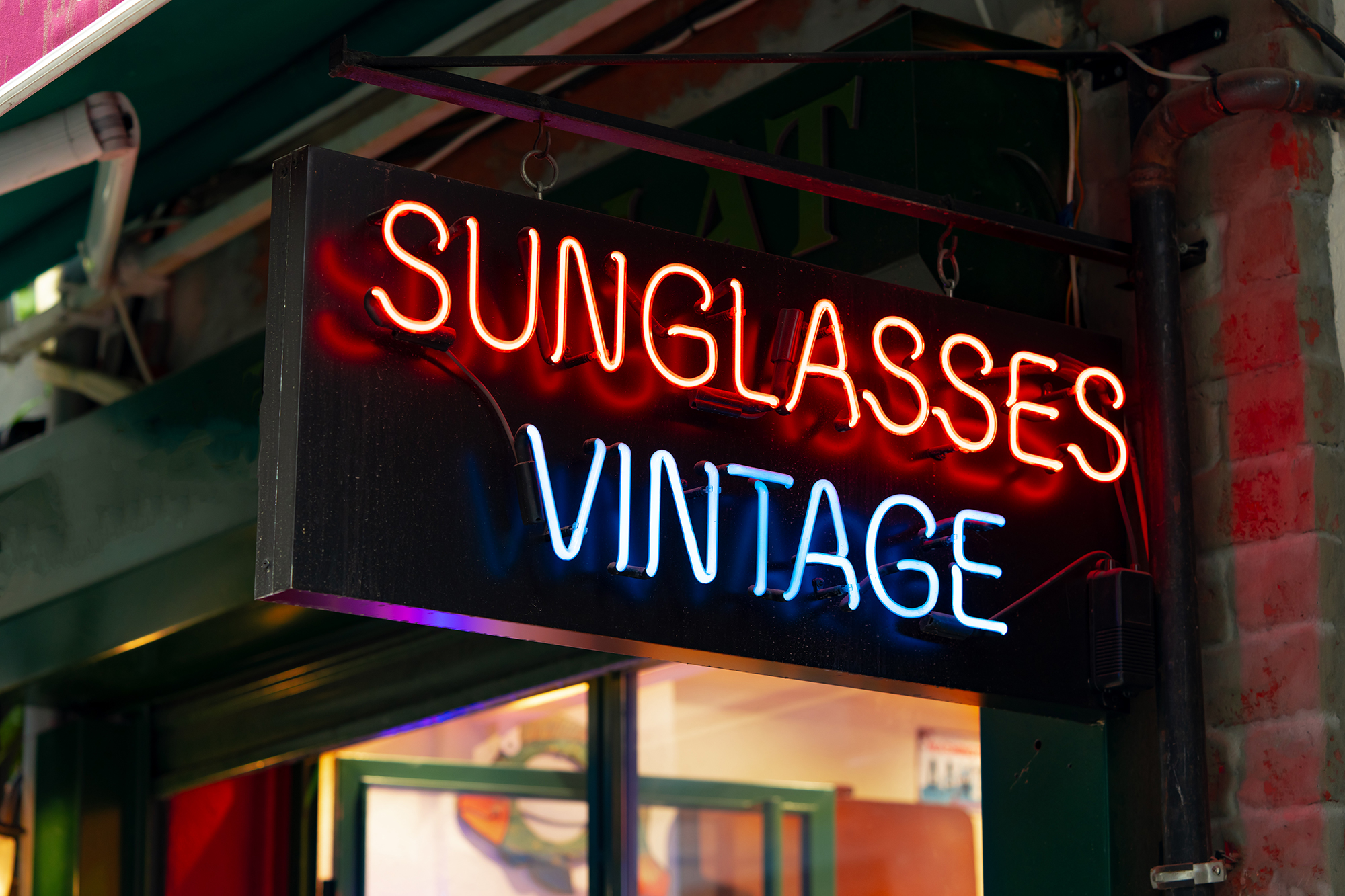
Lighting is often the key element that brings a sign to life after dark. Frequently, commercial operations will utilize backlighting so that the lettering glows or have spotlights to illuminate the key logo.
Some signs even employ subtle movements to direct even more attention. In Georgia’s bustling cities, proper illumination will save lives.
Incorporating Innovative Sign Technology
Modern business signs throughout Georgia make an immediate impression because they’re doing business for you around the clock. These signs use innovative technology to ensure your message is always up-to-date. They turn heads, right on your street corner, or wherever your ever-changing installation is located.
Unlike traditional printed signage, digital displays allow you to easily change promos or important updates, ensuring your information is always relevant. You could promote a lunch special in the morning, then feature a new product by the afternoon. Videos and short animations are much more effective at capturing and keeping attention than text alone. This is especially useful for telling your story on crowded thoroughfares like Atlanta or Savannah.
We get it, cost is always a key consideration when choosing signs. Digital signs require a significantly larger initial investment than a traditional printed sign. In the long term, you are saving money because you’re not having to reprint every time there’s a new offer or any other kind of change.
You achieve far greater utility from the same sign, and changes are just a few taps away. This is true for hole-in-the-wall bodegas as well as national 7-11s.
Exploring Digital Display Benefits
The most significant benefit is arguably LED lighting. Modern lights consume far less electricity and have much longer lifespans, reducing both energy costs and maintenance. You can program them to glow different colors or flash to announce a limited-time offer.
Other retailers are designing stores with warm, soft lighting to set an inviting mood. Some implement their brand colors in attention-grabbing ways, ensuring their community can identify them from the highway. Good lighting makes people feel safe and welcome, making them want to return.
Using Dynamic Lighting Techniques
Interactive signs take it a step further. QR codes and NFC tags make it easy for users to simply scan with their smartphone. This step takes them right to your website or ad campaign.
Touch screens only make sense for a fast menu or a fast checkout. Shops get more people to take the plunge when the signs beckon them to come and play. It’s easy to see how many people click on or scan, letting you determine what works best.
Integrating Interactive Sign Elements
Choosing the right location for your sign is as important as the technology itself. Signs will receive the greatest number of views when located where people are traveling on foot or by vehicle at a close distance.
Thinking about where your neighbors are—if you’re near a rival or a spot that draws crowds—can help your sign do more for you. The buildings that surround you play a huge part in how you see it.
A high-tech sign with integrated bold bright lights and colors completely pops off the page against many simple backdrops.
Reflecting The Unique Georgia Vibe
Georgia’s finest commercial signs are an irreplaceable part of the streetscape. Each sign blends in with the city or town where it stands, shaped by local tastes and the day-to-day culture. For me, it’s learning what Georgians want to see on their streets.
Some of these towns embrace that old-school, historic vibe, while other communities like a more contemporary feel. Cozy coffee shop in Savannah with hand-painted wood and muted warmth, earthy colors. By comparison, a technology startup in Atlanta might choose a contemporary aesthetic, using metal lettering with clean lines and more vibrant colors.
The most effective signs capture images you find everywhere across Georgia, whether it’s peaches, magnolias in the spring, or some deep red clay colors. These touches cut down on cluttering layouts and speak to people immediately with a friendly tone.
I see how a bakery in Macon uses peach-shaped signs, or a hardware store in Athens highlights local brickwork in its design. When I install these little pieces, the sign starts to settle in and find its place.
Tapping Into Regional Aesthetics
When I speak with entrepreneurs and creatives in our community, they inform me about what issues are a priority — whether that’s family, pride in their neighborhood, or supporting their local sports team.
When I produce signs that are exhibited to the community, their local college homecomings, high school athletic victories, and small business weeks, they keep in mind. They have a sense that they are a part of a greater whole.
Signs designed in this manner highlight elements of the town’s pride, whether that be a city’s anniversary or local citizens who were celebrated as heroes.
Connecting With Community Identity
An effective sign is a clear reflection of what your business represents. I rely on colorful visuals and short prose to help make that story.
A pet shop might use a mural of dogs from the local shelter, while a bookstore might showcase quotes from Georgia authors. These decisions establish an authentic connection with people traveling through.
Storytelling Through Sign Design
In my case, I work with all three signs. Window decals, sidewalk boards, and wall art campaigns all play a role through synergy.
Their colorful murals and boisterous marquees let people know what to expect inside and out. When the style is consistent—colors, fonts, images—the entire space comes across as polished.
It allows people to identify and have a reference point with the store or business each time they return.

Combining Sign Types For Impact
When collaborating with businesses in Georgia to enhance their messaging, I’ve found that combining different types of signage, such as monument signs, window graphics, and interior signage, can create a significant impact.
Monument Signs
A well-placed monument sign near a campus entrance immediately captures attention. I prefer using durable, weather-resistant materials like brick or stone, ensuring the sign maintains its brilliance even after years of exposure to sun and rain. The design, including shape, color, and style, aligns with the brand, allowing people to recognize the business instantly. Incorporating attractive landscaping, such as well-trimmed shrubs or colorful flower beds at the base, draws attention to the property and conveys a sense of pride and ownership.
Window Graphics
Window graphics transform glass storefronts by adding traditional or animated art that grabs customers’ attention. They can be used to announce sales or new arrivals, adhering strictly to the brand’s colors, logos, and fonts to maintain consistency. Changing window images with the seasons or for special events adds visual interest and encourages repeat visits. Careful attention is given to the percentage of the window covered, ensuring that light still shines in during the day and people can see inside.
Interior Signage
Inside, thoughtful signage directs visitors and presents the space as welcoming. Wayfinding signs are installed where people often enter stores or navigate aisles. Including brand elements, such as specific colors or logos, reinforces the messaging. Welcoming messages at the front entrance or checkout immediately convey an open and inviting atmosphere. Essential information, such as operating hours or safety regulations, is displayed on these legible signs.
Design Considerations
Before installing any signage, it’s important to consider local codes, safety regulations, and zoning requirements. Ensuring that each sign is impactful, structurally sound, safe, and accessible is a crucial aspect of signage design.
Navigating Sign Rules And Safety
As a sign designer working in Georgia, I help companies navigate the rules that affect each and every move. I’m involved from design through to installation and beyond. I’ll briefly explain zoning laws first. Each city or county determines their own sign regulations.
These regulations govern where a sign can be located, how large it can be, and what it can look like. In many places, a sign can only be 36 sq. Ft. Per street-facing business. At the same time, other states or localities have stricter sign controls in place to protect areas around high-traffic roads.
I always call city offices to get the latest guidelines, since rules change and local staff can clear up small details fast. I used to be most interested in which kinds of signs were permitted. Most municipalities prohibit illuminated or electronic signs, particularly when adjacent to residential areas or schools.
Many cities require a special use permit before you can install an LED or flashing message board. Understanding these restrictions in advance saves me, and thus the city, from making potentially expensive alterations down the road. When I plan a new sign, I map out where it will stand, how far it sits from the street, and whether the lighting fits local rules.
Understanding Local Zoning Laws
Safety has always been at the core of my work. I want to prevent what I call the “Medusa effect,” where, in high wind conditions, if the structure has brackets or poles, they can whip around. Quality signs make sure they’re made out of good materials like steel or weather-treated wood, and proper installation prevents them from becoming loose.
I always do a quick inspection for anything rust, crack, loose parts, then storms come and go, doing those afterwards too. For wider, busier sidewalks, I provide bumpers or padding around sign feet to protect pedestrians.
Meeting Accessibility Requirements
As someone who designs signs, I want everyone to be able to safely read a sign clearly. That translates to large, legible text, and colors designed to contrast against the background. What I like to do is hang signs at eye level—about five feet from the ground.
As appropriate, I bring in Braille or raised letters for a tactile experience. In this manner, all visitors receive the information they are looking for.
Conclusion
The best Georgia business signs aren’t the flashiest, they’re the most effective at getting people inside. Bright colors, big letters, and clever design elements — what’s not to love? Good signs use sturdy stuff like metal or thick plastic, so rain or hot sun doesn’t wear them down fast. Using large letters or attention-grabbing lighted signage ensures locations are visible day and night. Neon or backlit panels adorn the Downtown Atlanta shops. Wood with faded painted names decorates the small Savannah storefronts.
Pairing hanging fabric banners with printed wall signs or perforated window graphics adds character to a location. While local ordinances determine what may be installed, the best signs transcend danger and distraction to remain unobtrusive and pleasant. Looking to have people notice your establishment before any other? Seriously, learn from the best—see what makes top Georgia business signs so great, so your business can earn a true once-in-a-lifetime opportunity to wow potential customers. Contact us today to get a custom sign made for your location.
Frequently Asked Questions
1. What Materials Are Best For Georgia Business Signs?
High quality, durable materials, such as aluminum, acrylic and HDU foam, are better able to withstand Georgia’s demanding climate. Specialty materials withstand humidity, sun, and rain, protecting your sign from the elements and ensuring a fresh, professional look for years.
2. How Important Is Sign Placement For Visibility?
Sign placement is key. Signs that are easy to see at eye level, facing busy thoroughfares, and not blocked by trees or other structures garner more attention and future customers.
3. Do Business Signs Need To Match Local Georgia Culture?
Yes. Signs that reflect Georgia’s local charm and style connect better with the community, making your business more memorable and inviting.
4. What Innovative Technologies Are Used In Top Georgia Signs?
LED lighting, digital displays, and interactive features are all the rage. Combined, these technologies make signs incredibly visible, especially at night, and capture the attention of customers more effectively to help boost business.
5. Are There Rules For Business Sign Installation In GeorgiaDefinitelyly don’t leave that out. Every municipality in Georgia controls its sign code, regulating size, placement, and especially lighting. Abiding by these regulations protects you from costly citations and keeps your sign from becoming a safety hazard or illegal obstruction.
6. Can Combining Different Sign Types Boost Business Impact?
Yes. Utilizing a variety of such items, such as monument signs, window graphics, and banners, produces a multi-faceted effect. This ensures powerful attention from all sides and constituencies.
7. How Do I Ensure My Business Sign Stands Out In Georgia?
Opt for high-contrast colors, simple sans-serif fonts, and interesting silhouettes. Mix local character with creative signage designand you’ll be sure to leave a great first impression.
Need Business Signs? Choose Alpharetta’s Trusted Commercial Sign Company
When your business signs don’t match the quality or energy of your brand, they can hold your business back. Faded lettering, poor placement, or generic designs don’t just go unnoticed—they can actively drive customers away. Tangerine Sign Studio knows how critical the right signage is for making your business visible, memorable, and successful.
As a leading commercial sign shop in Alpharetta, GA, Tangerine Sign Studio offers customized business sign solutions designed to enhance your brand presence. With over 25 years of experience in advertising and design, we specialize in crafting high-impact signs that get noticed and get results. From bold storefront signs and polished interior signage to dynamic event displays, we bring your vision to life with creativity, precision, and purpose.
The result? Business signs that reflect your brand’s true potential, attract attention, and inspire confidence. Let Tangerine Sign Studio help you create signage that not only gets seen but also makes a powerful statement. Contact us today to start building the business signs your company deserves. Together, we’ll ensure your brand leaves a lasting impression.
Disclaimer:
The information provided on this website is for general informational purposes only and should not be considered professional or legal advice. While Tangerine Sign Studio strives to ensure the accuracy and timeliness of the content, we make no representations or warranties of any kind, express or implied, regarding the completeness, accuracy, reliability, or suitability of the information, services, or related materials on this site. Any reliance on the content found here is strictly at your own risk. Tangerine Sign Studio shall not be liable for any loss or damage, including but not limited to indirect or consequential loss, arising from the use of this website. Links to third-party websites are provided for convenience and informational purposes only; we do not endorse or have control over their content. For specific guidance on signage projects, permitting, or design recommendations, we encourage you to contact our team directly.